
Strategies for Increasing Sales Conversions Using eBay Template Design
What makes an eBay listing convert? It is tempting to answer with a color, a banner or a clever layout. In reality, buyers are asking a series of practical questions. This guide examines the practical strategies behind a persuasive listing, connects each one to BoostOnTime features and shows how to test improvements honestly.
📋 In This Guide
- 1The Conversion Principle
- 2What a Buyer Needs From the Template
- 318 Strategies for Conversion-Focused Design
- 4Product-Category Conversion Priorities
- 5Why BoostOnTime ETB Is the Practical Platform
- 6A Step-by-Step Conversion Template Build
- 7Measuring Conversion Improvements Responsibly
- 8A 20-Point Conversion Template Audit
- 9How ETB Addresses Common Buyer Objections
- 10Writing Style, Risk Levels and Maintenance
- 11Common Conversion-Design Mistakes
- 12A Seven-Day ETB Conversion Sprint
- 13Frequently Asked Questions
What makes an eBay listing convert? It is tempting to answer with a color, a banner or a clever layout. In reality, buyers are asking a series of practical questions: Is this the exact item I need? What condition is it in? Can I trust the seller? What will happen after I pay? Can I understand all of this easily on my phone?
An effective template helps them answer those questions with less effort. It creates a clear route from product identity to evidence, specifications, seller reassurance and purchase terms. It does not guarantee a sale, and it cannot rescue an unwanted product, an uncompetitive price or poor seller performance. What it can do is remove avoidable hesitation.
That is the logical starting point for conversion-focused design. Your job is not to make the listing look busy or “salesy.” Your job is to make the buying decision easier.
BoostOnTime ETB is built for that job. It gives sellers responsive themes, more than 20 customizable modules, dynamic product information, multiple templates, preview tools and Batch Revision. You can create a design around the buyer’s decision path, apply it to selected listings and improve it without manually rebuilding every description.
In this guide, we will examine the practical strategies behind a persuasive listing, connect each one to BoostOnTime features and show how to test improvements honestly. If your current template is decorative but difficult to scan, this is the framework for replacing it with something more useful.
The Conversion Principle: Reduce Uncertainty Before Adding Promotion
Every purchase contains uncertainty. On eBay, that uncertainty may concern model compatibility, size, condition, authenticity, delivery, returns or the seller. The higher the price or risk, the more evidence the buyer needs.
Templates influence conversion when they organize that evidence. A prominent gallery can reveal condition. Specifications can confirm dimensions or compatibility. Policy Tabs can make shipping and returns easier to understand. A concise Why Us section can explain service standards. The Feedbacks module can present genuine customer comments and rating information as social proof.
Promotion comes after clarity. A banner or Related Products section can be valuable, but neither should push essential product information out of the buyer’s immediate view. When everything is emphasized, nothing is emphasized.
Use this rule during every design decision: if an element does not answer a buyer question, strengthen trust or support relevant navigation, it must justify the space it occupies.
What a Buyer Needs From the Template
This table is also a template audit. Open one of your listings and ask whether each expectation is satisfied without forcing the buyer to search through repeated slogans or long paragraphs.
18 Strategies for Conversion-Focused Design
Strategy 1: Start With an Accurate Product, Not a Beautiful Frame
A template presents listing information; it does not validate it. Before redesigning anything, review the title, description, item specifics, price, condition details and images. Confirm that the information agrees across the listing.
This matters because a polished template can make an error more visible. If the title names one model and the specification table names another, professional styling will not restore trust. If the photographs conceal damage, a strong brand header may make the buyer even more suspicious.
BoostOnTime imports supported dynamic information from existing listings, including images, descriptions, item details, title, price, currency, categories and related products. Clean source data gives those modules something useful to present.
Create a short pre-template checklist for each category. Electronics may require model, connectivity and included accessories. Fashion may require measurements and material. Automotive parts may require part number and fitment. Accuracy is the first conversion strategy because every later design choice depends on it.
Strategy 2: Give the Product the First Visual Priority
The buyer came for the item, not your banner. A store logo can establish identity, but the product should dominate the early information hierarchy.
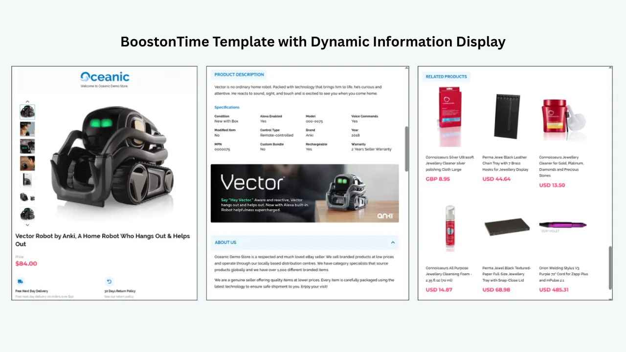
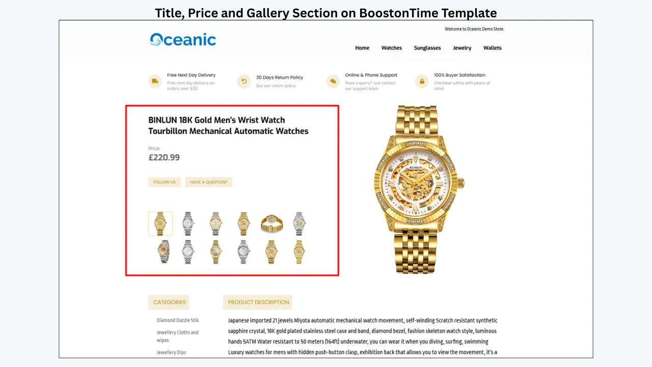
Place Title and Price, Gallery and a concise product summary near the top. Avoid a tall header that forces the buyer to scroll through generic brand messages before seeing what is for sale. On a mobile screen, even a modest desktop banner can become a substantial obstruction.
The ETB module system gives you control over this order. Use that flexibility deliberately. A strong opening usually follows a simple sequence: product identity, visual evidence, essential benefit or condition summary, then detailed evaluation.
If a promotional message must appear near the top, keep it narrow and relevant. “Specialist in tested vintage audio” may support the product. A large, unrelated seasonal graphic may not.
Strategy 3: Build a Gallery That Answers Questions
Images are evidence. They should not merely make the page attractive; they should help the buyer inspect the offer.
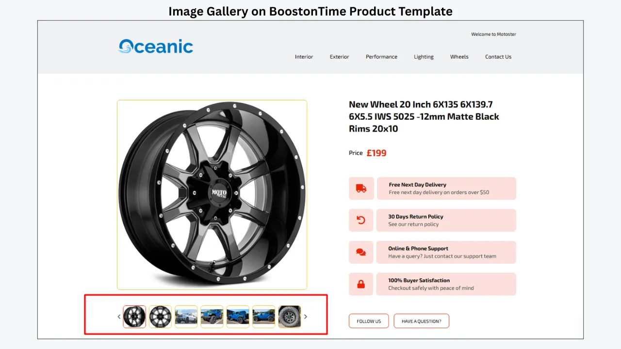
Use clear, well-lit photographs and show multiple angles. Include close-ups of labels, connectors, hallmarks, texture, included accessories and flaws where relevant. eBay permits up to 24 photos and recommends sufficiently large images; its guidance suggests around 1600 by 1600 pixels for good zoom quality. Follow the current marketplace rules when preparing media.
BoostOnTime’s Gallery module collects supported product images from the existing listing and places them inside the responsive template. This avoids rebuilding a gallery manually for every item and keeps visual presentation consistent.
Consistency should not become sameness. A handbag needs interior, hardware and corner images. A circuit board needs model markings, ports and condition evidence. A ring needs hallmarks, profile and scale. Define a category-specific shot list, then let the Gallery module present the resulting evidence clearly.
Do not place logos, watermarks or off-eBay contact information on product images where marketplace rules prohibit them. Use images you own or are authorized to use, and ensure they represent the actual product accurately.
Strategy 4: Use a Concise Opening Summary
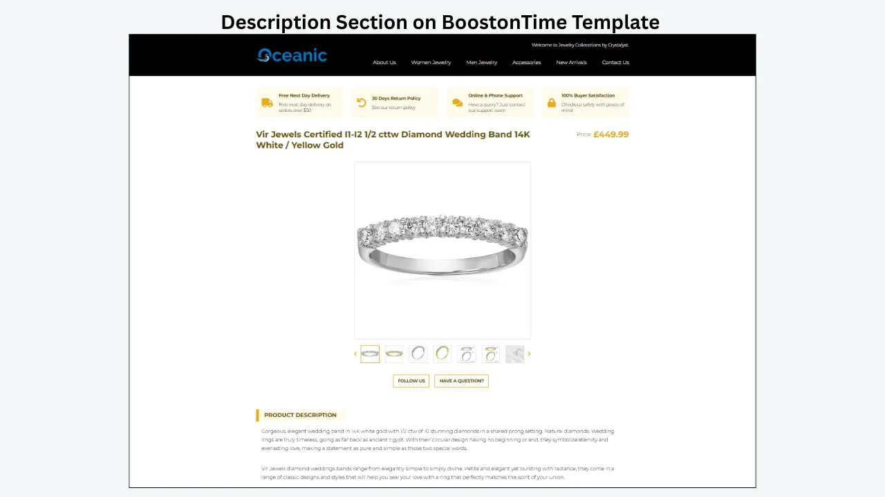
Many descriptions fail at one of two extremes. They open with a wall of text, or they provide almost no useful context. A better approach is a short summary that tells the buyer what the item is, its most important benefit or use, its condition and the key inclusion or limitation.
For example: “Refurbished network switch tested for power and port connectivity. Includes rack ears and power cable; original packaging is not included.” That sentence does real work. It establishes identity, condition, validation and contents.
Use the Descriptions module for this narrative, then support it with the Specifications module. Do not repeat the title word for word or stack generic adjectives such as “amazing,” “stunning” and “must-have.” Specific information is more persuasive than enthusiasm without evidence.
Strategy 5: Separate Benefits From Specifications
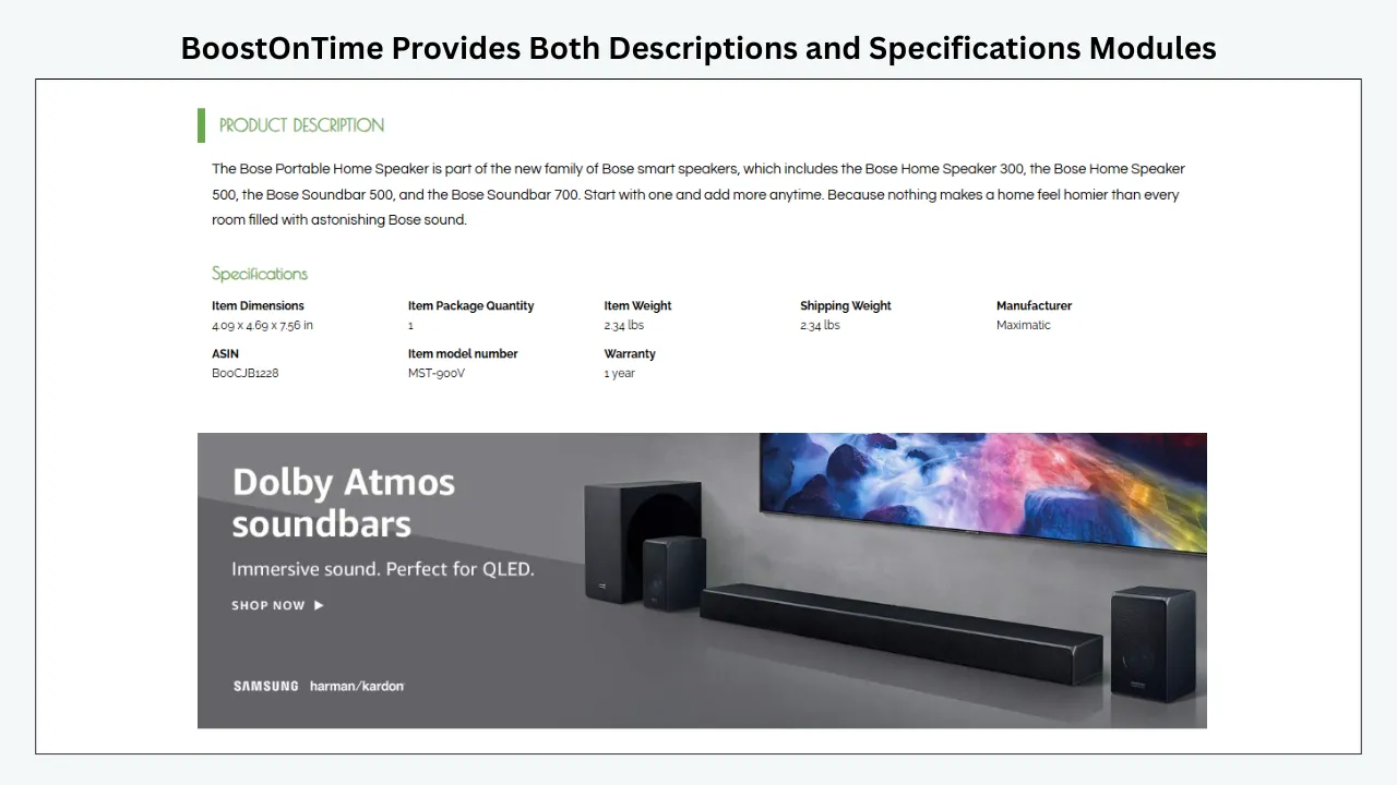
Benefits explain why the product may matter. Specifications help the buyer confirm whether it fits. Mixing them into one long paragraph makes both harder to scan.
Use a short benefit-led description followed by structured facts. A camera lens description may explain its suitability for portraits, while the specification section lists mount, focal length, aperture, filter size and condition. A sofa description may describe comfort and style, while specifications list dimensions, material and assembly requirements.
BoostOnTime provides both Descriptions and Specifications modules, so you can create this separation without hand-coding tables for each listing. Keep labels consistent within a category. “Width,” “height” and “depth” should not change order randomly from one listing to another.
Structured information is especially important on mobile. A buyer can scan short labeled facts more easily than a dense block of prose.
Strategy 6: Put Condition Evidence Where Buyers Can Find It
Condition is not a footnote, particularly for pre-owned, refurbished, vintage or collectible goods. State it clearly in the description and support it with photographs.
Avoid vague phrases such as “good for age” unless you explain what that means. Mention scratches, missing accessories, repairs, tests completed and functions not tested. If the item is new but the packaging is damaged, make the distinction obvious.
A clear condition section may feel less promotional, yet it often supports better buyer confidence and more appropriate purchases. The goal is not to attract every click. It is to help the right buyer understand the real offer.
Use the Gallery for visual evidence, Descriptions for the narrative and Specifications for factual details. The template’s clean structure makes honest disclosure easier to notice rather than easier to hide.

Strategy 7: Design Trust Into the Page
Trust is not created by writing “trusted seller” in large letters. It comes from consistency, specificity and evidence.
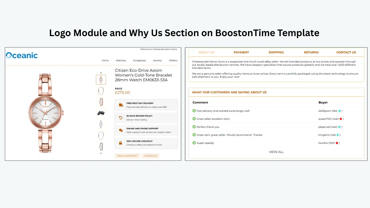
Use the Logo module to establish a recognizable identity. Keep the Why Us section short and concrete: relevant experience, testing process, dispatch standards or specialist knowledge. Use the Feedbacks module to integrate customer comments and rating information. Make sure feedback is genuine and presented accurately.
The visual design should support the same impression. Consistent typography, restrained colors, balanced spacing and a complete footer suggest that the store pays attention. Misaligned banners, several competing fonts and obsolete policy copy suggest the opposite.
Trust content should not make unsupported claims. Do not imply that a marketplace, manufacturer or certification body endorses the seller unless it genuinely does. Do not create synthetic testimonials. Social proof works because it is real.
Strategy 8: Make Shipping, Payment and Returns Easy to Understand
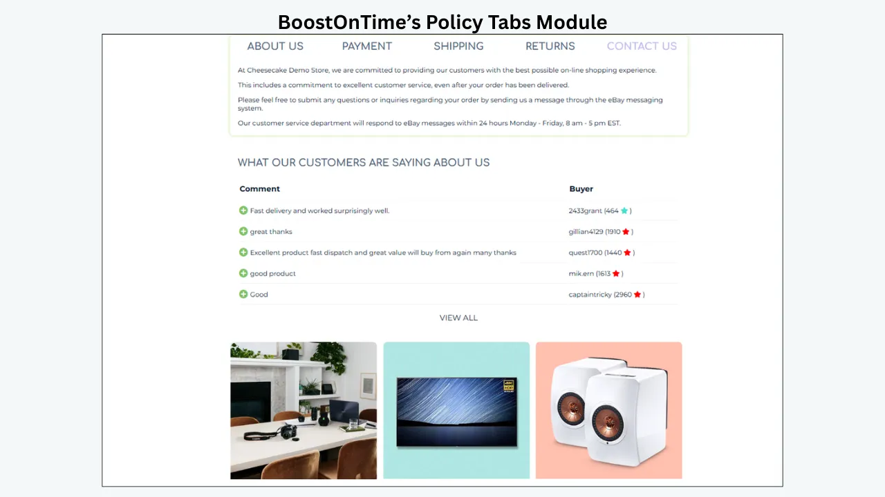
Unclear post-purchase terms create hesitation. Buyers want to know when the item will be dispatched, how it will be delivered, what returns are allowed and what they should do if there is a problem.
BoostOnTime’s Policy Tabs module organizes payment, shipping and returns information without forcing the buyer through a continuous block of text. Keep the wording concise and aligned with the actual listing settings. The template must not promise a delivery service or return condition that the listing does not provide.
Do not use policy content as a place for hostile warnings. Clear expectations protect the business; aggressive language can make every buyer feel suspected. Explain responsibilities in plain terms and direct the shopper to eBay’s approved processes where appropriate.
Strategy 9: Design Mobile First
Responsive design is more than shrinking columns. It is deciding what deserves to appear first when space is limited.
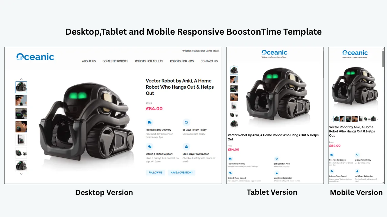
On a phone, check whether the product title is readable, images fit the screen, specifications do not require horizontal scrolling and policy text uses comfortable type. Check that banners do not dominate and that navigation targets are easy to tap. Read the template from top to bottom as a buyer would.
BoostOnTime themes are responsive and can be previewed for desktop, tablet and mobile. Use preview during creation, then inspect live listings on actual devices. Real content can expose issues that a theme sample does not: unusually long titles, many specifications or images with different proportions.
Mobile clarity supports conversion because it reduces effort. It is not a separate design project; it is the primary constraint that keeps the information hierarchy disciplined.
Strategy 10: Keep the Template Lightweight
Slow or cluttered descriptions interrupt the buying process. Compress images appropriately before uploading, avoid unnecessary decorative graphics and do not depend on prohibited active content.
eBay does not allow active content such as JavaScript, Flash, plug-ins and form actions in listings. External code can also create security, mobile and loading problems. A template builder designed for eBay is safer than copying an old script-heavy layout from an unknown source.
Every module should earn its place. A useful Gallery is worth the page space. Four different promotional banners repeating the same promise are not. A clean template often feels faster because the buyer can find information without navigating visual noise.
Strategy 11: Use Related Products With Intent
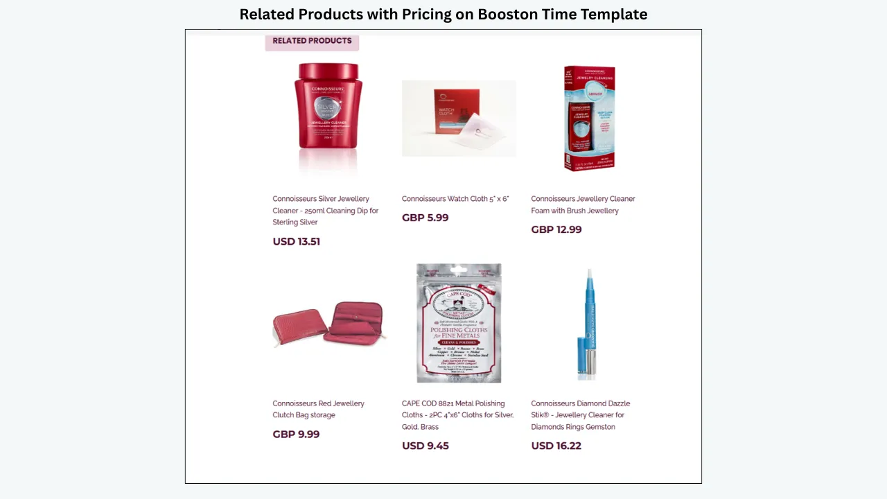
Related products can help a buyer find a compatible accessory, a different size or an alternative condition. Random products may add motion to the page without adding relevance.
BoostOnTime allows related products to be selected manually or collected randomly from the catalogue. Use manual selection when compatibility, style or price relationship matters. A laptop listing might show a suitable docking station or charger. A necklace might show earrings from the same collection. A replacement part should only suggest products that make sense for the vehicle or repair.
Place Related Products after the main decision content. Do not invite the buyer away before they have understood the current item.
Strategy 12: Use Categories as Helpful Navigation
The Categories module can help shoppers explore the store, particularly when the current product signals a broader interest. Keep category names recognizable and specific. “Women’s leather handbags” is more useful than “Collection 4.”
Navigation should stay within eBay’s permitted environment and follow current link policies. Avoid external contact paths, off-platform checkout prompts or promotional routes that conflict with marketplace rules.
For a focused seller, categories reinforce expertise. A buyer viewing a rare vinyl record can see that the store also organizes genres or formats. That structure makes the catalogue easier to understand and the brand easier to remember.
Strategy 13: Use Banners Sparingly
Banners can communicate a real benefit, campaign or operational message. They become harmful when they compete with the product or remain live after the message expires.
Use one focused banner when necessary. Give every campaign asset a start date, end date and owner. Remove “holiday dispatch” copy when the holiday passes. Avoid generic claims that add no information.
BoostOnTime includes Banners, Side Mini Banners and Mini Banners, so you can choose the scale that matches the message. The existence of three options is not a reason to activate all three. Restraint makes the selected message more noticeable.
Strategy 14: Create Templates by Decision Pattern
Multiple templates are valuable when they reflect how buyers evaluate different products. Do not create variants based only on decorative preference.
An electronics template may lead with model, ports and compatibility. A fashion template may lead with gallery, size and measurements. An automotive template should surface part number and fitment. A collectible template should prioritize condition, authenticity evidence and provenance.
BoostOnTime lets subscribers create multiple templates while maintaining shared brand identity. This approach improves relevance without turning each listing into a one-off design project.
Strategy 15: Maintain One Clear Visual System
Choose a limited color palette, one or two typefaces and consistent spacing. Use heading levels predictably. Apply the same button and label styles throughout the template.
A coherent system helps the buyer recognize which information is important. It also makes maintenance easier. When every module invents a new look, the page feels assembled rather than designed.
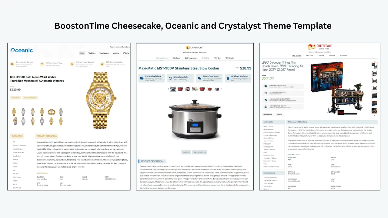
BoostOnTime themes—Cheesecake, Oceanic and Crystalyst—provide structured starting points. Select the theme based on information flow and category needs, then customize it to the store. The best design should feel like your brand without obscuring the product.
Strategy 16: Match the Message to the Traffic Source
Some buyers arrive after a specific search and need immediate confirmation. Others enter through a promoted listing, a category page or the store. The template should work for all of them, but the opening must never assume that the shopper already understands the product.
Use the title, gallery and first description lines to restate the essential offer. Avoid opening with a generic company history. Seller background can appear in Why Us after the product has been identified.
This ordering respects attention. The buyer receives the answer that caused the click, then supporting reasons to trust the transaction.
Strategy 17: Remove Repetition
Repeated phrases do not become more persuasive. If “fast dispatch” appears in the banner, Why Us, description, policy and footer, the listing feels padded.
Assign each message to one logical module. The description explains the product. Specifications hold facts. Why Us differentiates the seller. Policy Tabs explain transaction terms. Feedbacks provides social proof. Footer closes the template.
Removing repetition shortens the mobile page and gives each remaining statement greater weight.
Strategy 18: Test the System, Not Just the Theme
Do not judge a template by a sample listing with perfect images and short content. Test it using real catalogue variations: long and short titles, one image and many images, used-condition descriptions, detailed specifications and different prices.
BoostOnTime’s preview and Batch Revision workflow supports a controlled rollout. Apply the template to a small representative group, inspect live pages and resolve edge cases before expanding.
The result should be repeatable. If every listing requires manual repair after application, the framework is not ready.

Product-Category Conversion Priorities
The table shows why one universal layout can be limiting. The brand can remain consistent while the information order changes to fit the category.
Why BoostOnTime ETB Is the Practical Conversion Platform
Conversion advice is easy to write and difficult to maintain. A seller may understand that specifications, policies and social proof matter, yet still lack a repeatable way to add them to hundreds of listings.
ETB turns the strategy into modules. You can choose a responsive theme, arrange the buyer journey, import supported product data and apply the design through Batch Revision. Static modules preserve shared content; dynamic modules keep the listing tied to the item.
The platform provides more than 20 modules, multiple templates, coverage for 19 eBay sites and more than 10 multichannel systems, plus unlimited listing updates. The monthly plan is $6.99, while the annual plan is $59.88, equivalent to $4.99 per month at the time of writing. A seven-day trial lets you test the workflow using real listings.
That combination matters because conversion design is not a one-time project. Products change, policies change, mobile expectations change and campaigns expire. A connected template system makes iteration practical.
A Step-by-Step Conversion Template Build
Choose one buyer and one category
Do not start with the entire store. Select a category where buyer questions are easy to identify and where enough listings exist to make a template worthwhile.
Review buyer questions
Read recent messages, returns and feedback. Note confusion about size, compatibility, condition, delivery or contents. These are direct clues about missing information.
Clean listing inputs
Correct images, titles, descriptions and specifications before import. Remove outdated claims and duplicated policy text.
Select a theme
Choose a responsive BoostOnTime theme whose structure supports the category. Do not select purely by color; customization can handle branding later.
Build the first-screen sequence
Place product identity, gallery and concise summary early. Check the mobile preview before adding promotional modules.
Add decision evidence
Configure Descriptions and Specifications, making condition, compatibility, measurements or included items easy to find.
Add trust and policy content
Use Logo, Why Us, Feedbacks and Policy Tabs. Keep every statement factual and aligned with live account settings.
Add relevant navigation
Configure Categories and Related Products only when they provide a meaningful next step. Prefer manual related-product selection for sensitive categories.
Simplify
Remove duplicated messages, unnecessary banners and modules that do not serve the buyer. Read the page from top to bottom on a small screen.
Test and apply
Use real listings with different content lengths. Apply the template to a small group through Batch Revision, inspect the live pages and then expand.

How to Measure Conversion Improvements Responsibly
Before the change, record a baseline for a representative group. Useful measures may include listing views, conversion rate where available, watchers, offers, buyer questions, returns caused by misunderstood details and time required to maintain listings.
After applying the template, compare the same measures over a suitable period. Keep price, advertising, shipping and promotions as stable as practical. Document seasonality, stock changes and major competitor activity.
Do not claim that the template caused every difference. If views rise because an advertising campaign started, that is not a design result. If returns tied to size confusion fall after measurements become prominent, the template may reasonably have contributed.
Operational metrics also matter. How long does it take to update a policy message? How many listings contain outdated banners? How many mobile issues appear in quality checks? A maintainable template can create value before sales data becomes conclusive.
A 20-Point Conversion Template Audit
Use the following audit before you redesign a listing and again after the new template is live. Score each item as complete, partly complete or missing. The score is not a promise of sales performance; it is a disciplined way to find friction.
Product identity
- The exact product is obvious. The title and first description lines agree on model, version, size or variant.
- The offer is distinguished from similar products. The buyer can tell whether this is an accessory, replacement part, bundle or complete item.
- The price context is clear. Included components and quantity are easy to understand, reducing mistaken assumptions about what the price covers.
Visual evidence
- The gallery begins with a clear primary image. The item fills enough of the frame to be inspected.
- Important angles are included. The image set answers category-specific questions rather than repeating nearly identical views.
- Condition is visible. Wear, packaging damage, repairs or missing pieces are photographed when relevant.
- Labels and identifiers are readable. Model numbers, hallmarks or compatibility markings can be confirmed where appropriate.
Decision information
- The opening summary is concise. A buyer can understand the main offer without reading the full page.
- Benefits and facts are separated. Narrative explains usefulness, while specifications provide verifiable details.
- Measurements use clear units. Dimensions, weight or sizing information is consistent and unambiguous.
- Compatibility is explicit. Technical or automotive products state the information a buyer needs to assess fit.
- Contents are listed. Included and excluded accessories, packaging, certificates and manuals are identified.
Trust and transaction confidence
- Seller information is specific. Why Us explains a real standard or expertise rather than using empty superlatives.
- Feedback is genuine and accurate. Customer comments and ratings are presented without alteration or invented context.
- Policies match the listing settings. Shipping, payment and returns wording does not contradict the live offer.
- The language is calm. Necessary limits are explained without treating every buyer as a potential problem.
Usability and focus
- The mobile order works. The product appears before large promotional areas, and the page is comfortable to scan.
- The design is restrained. Type, color and spacing form one system rather than several competing styles.
- Navigation is relevant. Categories and related products help the current shopper instead of creating random exits.
- The template is maintainable. Shared messages have owners and dates, dynamic information comes from reviewed listings, and the design can be revised without manual reconstruction.
An audit creates a better conversation than “Do we like this design?” Personal taste still has a role, but each choice must support a buyer need or an operating requirement.
How ETB Addresses Common Buyer Objections
Conversion often slows because an unanswered objection remains in the buyer’s mind. A template cannot anticipate every concern, but category research and customer-service history reveal recurring patterns.
“I am not sure this is compatible”
Place model, part number, dimensions and known compatibility in Specifications. Use Descriptions to explain limitations that do not fit a short field. Show labels or connectors in the Gallery. Do not use a banner to carry critical fitment data because it may be overlooked or become difficult to update.
“I cannot judge the condition”
Combine a plain-language condition narrative with close, honest photographs. Separate cosmetic wear from functional testing. If a function was not tested, say so. A clear limitation can be more credible than a sweeping assurance.
“I do not know this seller”
Use Logo for recognizable identity, Why Us for concrete service standards and Feedbacks for genuine customer experience. Keep the visual system consistent. Trust grows when evidence, wording and presentation point in the same direction.
“I am worried about delivery or returns”
Use Policy Tabs to organize current shipping, payment and return information. Mention special handling only when it actually applies, such as insured delivery for higher-value products. Make sure the template agrees with eBay’s settings.
“I need another size, color or model”
Use Categories and carefully chosen Related Products to provide a useful next step. A relevant alternative can retain a shopper who would otherwise leave, but it should never create confusion about the current item.
“The page looks difficult to use”
Choose a responsive theme, simplify the module order and reduce decorative assets. Test with the longest realistic title and specification set, not only a perfect sample. Ease of use is part of credibility.
Writing Style, Risk Levels and Maintenance
Writing Style That Supports the Design
Good layout cannot compensate for vague copy. Write in short, informative sections with labels that match buyer language. Prefer “Includes charger and UK power lead” to “Everything you need.” Prefer “4 mm scratch on the left edge” to “Minor signs of use.”
Use headings to create a decision path: Overview, Condition, Specifications, Included Items, Shipping and Returns. Avoid keyword repetition that makes the copy unnatural. Search visibility begins with accurate listing data, while the template should help a human understand it.
Keep promotional language proportional to the evidence. “Professionally tested for power, display and audio output” is useful when those tests were completed. “Best quality on eBay” is difficult to substantiate. Conversational copy can still be precise: speak to the buyer as a knowledgeable seller who wants the purchase to be right.
Designing for Different Levels of Purchase Risk
Not every product requires the same amount of reassurance. A low-cost new accessory may need a clear image, compatibility facts and simple delivery terms. A vintage watch or specialist component may require many photographs, detailed condition, provenance and a stronger returns explanation.
Create templates by risk as well as category. A high-value version can give Gallery, Specifications, Why Us, Feedbacks and Policy Tabs more prominence. A low-complexity version can stay shorter. Both should use the same store identity.
This approach keeps the template proportional. Too little information creates doubt; too much generic information creates fatigue. ETB’s multiple-template capability lets the seller match evidence to the seriousness of the decision without abandoning a consistent brand.
Content Maintenance as a Conversion Strategy
Outdated content quietly damages trust. A banner that mentions a past holiday, a returns paragraph that conflicts with current settings or a broken category label suggests that the store is not paying attention.
Give every shared module an owner. Review policies after operational changes, campaigns at their end dates and navigation when catalogue structure changes. Use Batch Revision to apply approved updates to the relevant listings. Keep a record of which template serves each category.
Maintenance is not glamorous, but buyers encounter the result. A current, consistent page feels dependable. A connected platform such as BoostOnTime turns that dependability from a one-time design achievement into an ongoing process.
One final checkpoint is to compare the template with the buying experience around it. The description should not contradict the item specifics, delivery estimate, returns settings or variation choices displayed by eBay. If a buyer sees different answers in different parts of the page, the polished section does not win; confidence falls. Review the full listing as one experience, including the native photo area and seller information, not as an isolated design panel.
Ask someone who did not build the template to complete three tasks on a phone: identify the exact model or size, find the condition limitations and explain what happens if the item must be returned. Time is less important than certainty. Note where the reviewer hesitates, scrolls backward or interprets a label incorrectly. Those observations often reveal more than an internal design discussion.
After correcting the problems, save the approved template as a controlled version and record the reason for each important module. This makes later edits more disciplined. A future team member will know that Specifications appears early because compatibility questions were common, or that a large banner was removed because it pushed product evidence too far down the mobile page.
Common Conversion-Design Mistakes
- Designing for the seller instead of the buyer. Internal slogans and brand history may feel important, but the buyer first needs product evidence.
- Hiding details behind vague persuasion. “Premium quality” is not a substitute for material, dimensions, model or condition.
- Overloading the top of the page. Large banners, navigation and newsletters can delay the product. Keep the opening focused.
- Using unrelated cross-promotion. Random alternatives distract. Show products that genuinely help the shopper compare or complete the purchase.
- Ignoring mobile order. A two-column desktop design may stack poorly. Test the actual reading sequence on a phone.
- Copying unsupported media or code. Use authorized content and follow eBay’s current images, links and active-content policies. Do not paste scripts from an old template source.
- Promising results. A template can support conversion, not guarantee it. Credible marketing explains mechanisms and limitations.
A Seven-Day ETB Conversion Sprint
Use the BoostOnTime trial as a structured experiment.
Day 1
Select a category, record baseline measures and collect buyer questions.
Day 2
Audit images, titles, descriptions and specifications for ten to twenty listings.
Day 3
Choose a responsive theme and build the product-first module order.
Day 4
Add trust, policy, feedback and relevant navigation modules.
Day 5
Review mobile presentation, simplify the template and verify dynamic data.
Day 6
Apply the template to a test group through Batch Revision and inspect live listings.
Day 7
Correct issues, record the final design and schedule a later performance review.
The sprint should end with evidence about maintainability and buyer clarity, not an unsupported conclusion about sales after only a few days.
Frequently Asked Questions
It is a responsive, clear layout that helps the buyer understand the product, evaluate fit or condition, trust the seller and understand transaction terms. It supports conversion by reducing uncertainty; it does not guarantee sales.
Gallery, Descriptions, Specifications, Policy Tabs, Why Us and Feedbacks address common buyer questions. Title and Price establishes context, while Categories and Related Products can support relevant exploration.
No. Use only the modules that serve the product and buyer. Too many elements can bury essential information and lengthen the mobile page.
Yes. ETB imports supported dynamic content such as images, descriptions, item details, title, price, currency, categories and related-product information. Verify the source data first.
Yes. ETB themes are responsive and include preview options. Inspect live listings on actual phones because content length and image proportions vary.
Do not treat design as a ranking guarantee. Accurate product data, relevant item specifics, compliant content, price, seller performance and other marketplace factors matter. The template’s primary role is to improve presentation and usability after the shopper opens the listing.
Use enough authorized, accurate images to show the product, important features, labels, included items and flaws. eBay currently permits up to 24 images, but quality and relevance matter more than filling every slot.
Organized policy information can reassure buyers, provided it matches the actual listing and account settings. BoostOnTime’s Policy Tabs module makes it easier to present payment, shipping and returns information clearly.
Yes. The Feedbacks module integrates customer comments and rating information. Present genuine information accurately and do not confuse visible feedback with an automated feedback-request system.
Prefer products that are compatible, complementary or credible alternatives. Manual selection gives more control, while random collection may suit broad general catalogues.
Redesign when buyer needs, brand identity, policy content or mobile performance justify it. Do not chase every visual trend. Modular updates are often better than a complete redesign.
Follow current eBay policy. Active content such as JavaScript, Flash, plug-ins and form actions is not allowed. Use supported, compliant media and avoid copied legacy code.
Compare a representative group before and after the change while documenting price, advertising, shipping, seasonality and stock differences. Review conversion data where available alongside buyer questions, returns and maintenance time.
At the time of writing, ETB costs $6.99 monthly or $59.88 yearly, equivalent to $4.99 per month when billed annually. A seven-day trial is available. Confirm current pricing before purchase.
Yes. BoostOnTime Batch Revision lets you apply a template to an individual listing or selected group. Test a representative sample before a broad rollout.
Turn Conversion Advice Into
A Maintainable System
The most persuasive template is not the one that looks most aggressive. It is the one that respects the buyer’s decision.
Show the exact product. Explain it quickly. Organize specifications. Disclose condition honestly. Present genuine trust signals. Clarify shipping and returns. Make the entire path comfortable on a phone. Then offer relevant alternatives without distracting from the original item.
BoostOnTime ETB makes those principles practical across a real catalogue. You can build responsive designs from established themes, arrange more than 20 modules, import supported product information, create templates for different decision patterns and apply them through Batch Revision. Unlimited listing updates let you keep improving the framework as the store changes.
Start with a category where buyers ask repeated questions. Build a product-first template, test it on real listings and measure both buyer behavior and maintenance effort. The objective is not decoration. It is a clearer, more trustworthy shopping experience that gives more qualified buyers the confidence to continue.
Ready to build an eBay template around the way buyers actually decide? Start your seven-day BoostOnTime ETB trial and create a responsive, conversion-focused listing system.
🚀 Start Your Seven-Day BoostOnTime ETB Trial
boostontime.com/ebay-template-builder