
Mobile eBay Listing Template Checklist: 15 Tests to Complete Before Publishing
A mobile-friendly eBay template must do more than fit a narrow screen. Use these 15 tests to check content order, images, typography, navigation, speed, policies and live-device performance before publishing. Then see how BoostOnTime ETB turns the checklist into a repeatable workflow for every listing.
A listing can look polished on a laptop and still become frustrating the moment a buyer opens it on a phone. The logo may take over the screen. A specification table may force horizontal scrolling. The product gallery may load slowly. The most important condition detail may appear after three promotional banners. Nothing is technically missing, yet the buyer has to work too hard to understand the offer.
That is the real mobile-design problem. Mobile optimization is not simply making a desktop template narrower. It is deciding what a buyer needs first, removing what gets in the way and ensuring every useful element remains readable, responsive and easy to reach on a small touchscreen.
Before you publish an eBay listing template, test fifteen areas: viewport behaviour, content order, opening clarity, typography, images, galleries, specifications, buttons and links, navigation, policy information, trust content, related products, page weight, eBay compliance and live-device performance. A template passes only when a buyer can understand the product, verify the important details and reach the next logical action without zooming, hunting or waiting unnecessarily.
This guide explains each test in practical terms. It also shows how BoostOnTime eBay Template Builder, or ETB, helps you turn mobile quality from a one-time design project into a repeatable listing system. With responsive themes, more than 20 customizable modules, dynamic listing information, multiple saved templates and Batch Revision, ETB gives sellers a manageable way to build, test and apply professional layouts without maintaining custom HTML by hand.
The Short Answer: What Makes an eBay Template Mobile-Friendly?
💡 Quick Answer
A mobile-friendly eBay listing template adapts to the buyer’s screen, presents essential product information early, uses legible text, scales images correctly and avoids elements that create delay or confusion. Its modules follow a logical single-column reading order. Links are useful and permitted. Policies remain easy to find. The design supports the product instead of competing with it.
The strongest template is not necessarily the one with the most graphics or sections. It is the one that answers the buyer’s questions in the fewest comfortable steps:
- What exactly is this item?
- Is it the right model, size, condition or version?
- What will I receive?
- Can I trust the seller and the information?
- What happens with delivery and returns?
- Is there another relevant option if this one is not right?
BoostOnTime ETB helps organize those answers through modules such as Title and Price, Gallery, Descriptions, Specifications, Why Us, Feedbacks, Policy Tabs, Categories and Related Products. Because the themes are responsive, the same framework can adapt across phones, tablets and desktops. Your responsibility is to choose the right modules, arrange them intelligently and verify the final live listing.
Ready to test a better workflow? Start your seven-day BoostOnTime ETB trial and build a responsive template around the information your buyers actually need.
The 15-Test Mobile eBay Template Checklist at a Glance
Quick reference
| Test | What you are checking | Useful BoostOnTime support |
|---|---|---|
| 1. Responsive width | No clipping, overflow or horizontal scrolling | Responsive themes |
| 2. Mobile content order | Essential information appears before secondary promotion | Customizable module order |
| 3. Opening clarity | Product identity and primary value are immediately clear | Title and Price, Descriptions |
| 4. Typography | Text is readable without pinching or zooming | Responsive theme typography |
| 5. Image scaling | Images remain sharp, proportional and within the screen | Gallery, dynamic images |
| 6. Gallery usability | Buyers can review useful product evidence comfortably | Gallery |
| 7. Specifications | Facts wrap cleanly and remain scannable | Specifications |
| 8. Tap targets | Links and controls are easy to select accurately | Header Menu, Helpful Links |
| 9. Navigation | Store discovery is useful but does not obstruct the product | Header Menu, Categories |
| 10. Policies | Shipping, payment and returns remain easy to locate | Policy Tabs |
| 11. Trust content | Branding and social proof reassure without dominating | Logo, Why Us, Feedbacks |
| 12. Related products | Alternatives are relevant and mobile-manageable | Related Products |
| 13. Loading discipline | Modules and graphics justify their page weight | Module selection, responsive themes |
| 14. eBay compliance | Content avoids prohibited or risky behaviour | Structured ETB workflow |
| 15. Live-device QA | Published output works in real mobile environments | Preview and controlled Batch Revision |
Use the table as a quick sign-off sheet, but do not treat it as a collection of independent boxes. The tests affect one another. A large banner changes the content order and loading time. A complex table affects width and typography. Too many related products increase page length and distract from policies. Mobile quality comes from the complete journey.
The 15 Tests in Detail
Test 1: Confirm That the Layout Fits the Mobile Viewport
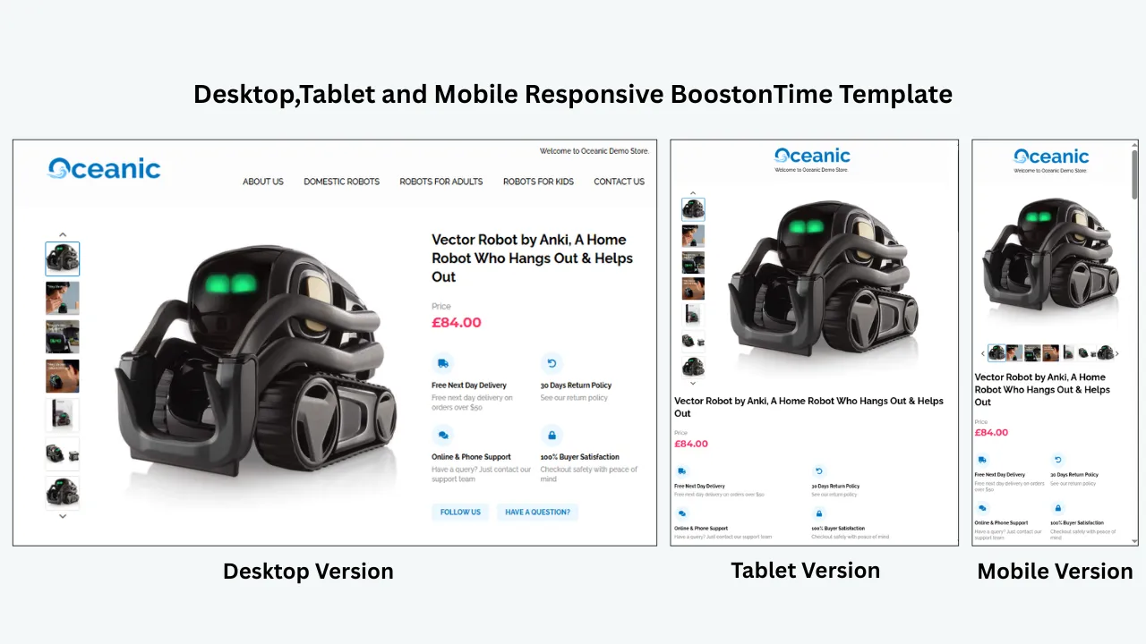
Begin with the most basic question: does the template fit the screen? A responsive design should adapt to the available width without forcing the buyer to scroll sideways. Text should stay inside its container. Images should shrink proportionally. Columns should stack or reorganize. Tables should wrap sensibly. Nothing important should disappear beyond the edge.
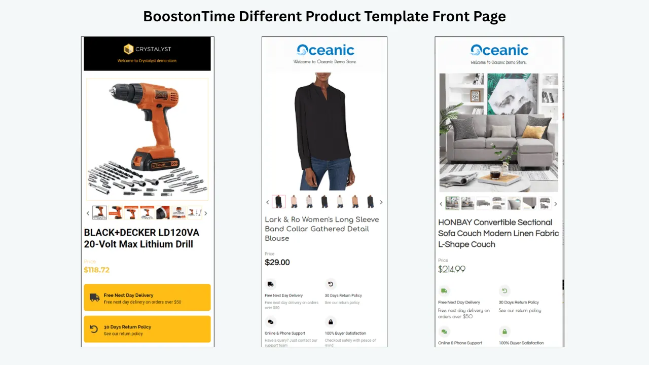
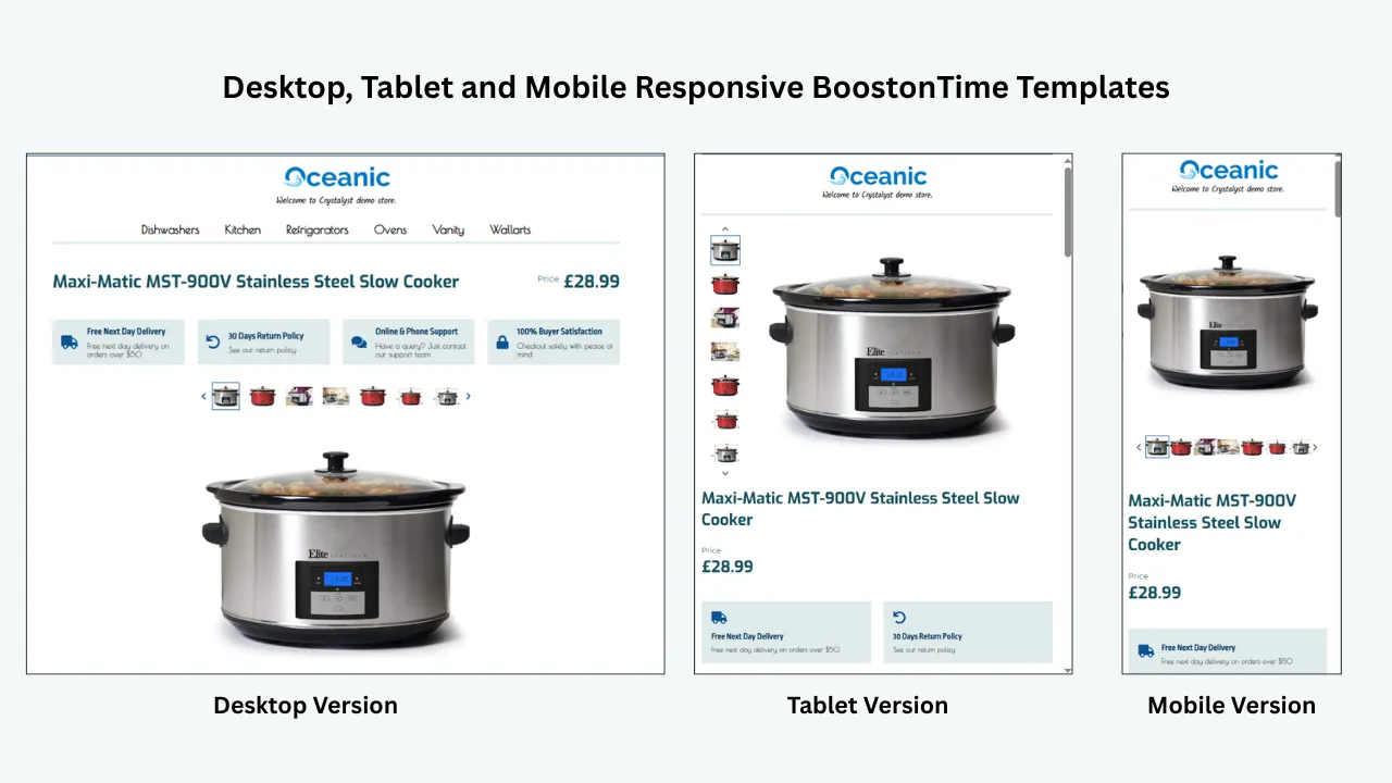
BoostOnTime begins with responsive themes rather than a fixed desktop canvas. Cheesecake, Oceanic and Crystalyst provide different visual starting points, but each is intended to work across mobile devices and tablets as well as desktops. That responsive base removes much of the manual CSS work associated with a static HTML file.
Still, responsive does not mean impossible to misuse. A very wide custom banner, an unusually long label or excessive content can challenge any framework. Preview the template, then inspect the live listing. If one module creates overflow, correct the underlying content or remove the module rather than accepting a compromised experience.
The listing remains inside the screen at common narrow widths, and the buyer never needs horizontal scrolling to understand the product.
Test 2: Check the Mobile Reading Order
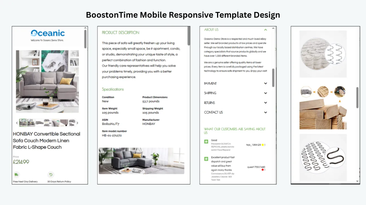
Desktop layouts often place content side by side. Mobile layouts usually stack those sections. The stacking order determines what the buyer sees first, second and tenth. A template can be technically responsive and still have a poor mobile journey if secondary banners appear before the description or navigation pushes the product details far down the page.
A practical starting order is:
- Compact logo or store identity
- Product title and price context
- Product gallery
- Short product summary
- Key features or condition points
- Specifications
- Detailed description
- Seller reassurance and feedback
- Shipping, payment and return information
- Relevant categories or related products
- A restrained footer
BoostOnTime’s modular structure makes this easier to manage. Instead of rebuilding HTML, you can select, restructure and style the modules that fit the product line. You can also create multiple templates when categories need different priorities. That is more effective than forcing every SKU into one universal arrangement.
Within the first few mobile screens, a buyer can identify the product, see it and reach the facts most likely to determine suitability.
Test 3: Make the Opening Immediately Understandable
The first visible content should answer “What am I looking at?” A vague greeting, decorative slogan or oversized campaign banner should not be the buyer’s main introduction to the item. Mobile attention is limited, so the opening must work quickly.
Use the Title and Price module to confirm product identity and price context. Follow it with a concise Description opening that states what the item is, who or what it is for and the most important differentiator. This is not the place for a complete company history or every specification. Think of it as a decision summary.
For example, an electronics opening may identify the model, condition, and compatibility. A clothing listing may state the garment type, size, material and condition. A furniture listing may lead with dimensions, finish and assembly status. A collectible may identify the edition, maker and grading status.
BoostOnTime can collect supported dynamic information such as the listing title, price and currency when the template is applied. That reduces repetitive setup, while the Description module gives you space for the buyer-focused explanation. Review the source listing first because dynamic presentation is only as accurate as the underlying data.
A new buyer can explain the item and its main relevance after reading the opening, without searching deeper in the page.
Test 4: Test Typography Without Zooming
Mobile text must be comfortable at the default viewing size. If buyers need to pinch and zoom, the layout has failed a basic usability test. Tiny text may allow more content above the fold, but it creates effort and undermines the professional impression the template is supposed to build.
Look at body size, line height, paragraph width, heading contrast and spacing. A narrow screen already creates frequent line breaks. Tight line spacing makes those lines merge visually, while overly loose spacing makes short paragraphs feel disconnected. Use short paragraphs and descriptive subheadings so buyers can scan without losing context.
Do not create hierarchy through size alone. Colour, weight and spacing can distinguish headings without turning them into giant blocks. Keep all-caps text brief because long capitalized phrases are harder to read. Avoid decorative fonts for product information. A brand typeface may work in a logo, but the description should prioritize clarity.
BoostOnTime’s responsive themes provide a coherent typography system, which is safer than combining several copied HTML styles across listings. Use the theme as a framework and keep your content formatting consistent. If imported description content includes old font tags or uneven sizing, clean it before rolling the template across the catalogue.
Titles, headings, labels and paragraphs are readable at normal phone zoom, and the visual hierarchy remains clear during a quick scroll.
Test 5: Verify Image Quality and Responsive Scaling
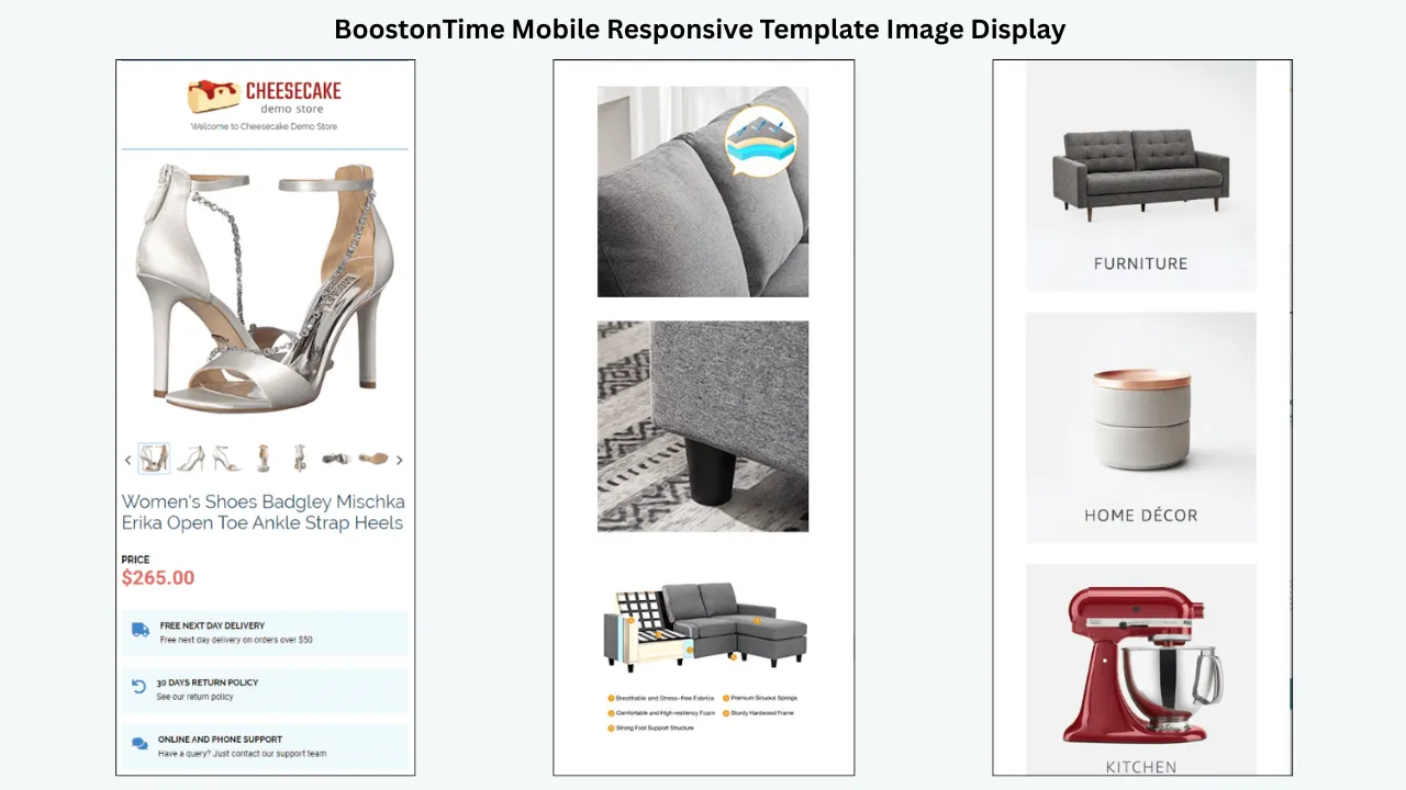
Images carry much of the selling work on mobile. Buyers use them to confirm appearance, condition, colour, included parts and scale. They should be large enough to inspect, sharp enough to support zooming and responsive enough to remain within the screen.
eBay recommends clear, high-resolution images and notes that images around 1600 by 1600 pixels work well. The primary photo should show the full item clearly, while additional photos can cover other angles, features and flaws. Exact requirements can change, so check eBay’s current image guidance when preparing your source listings.
Resolution is only one part of the test. Check whether the template distorts an image by forcing the wrong width-to-height ratio. A square product photo should not become stretched vertically. A portrait image should not be cropped unpredictably. Details should remain visible against the background, and image files should not be unnecessarily heavy.
BoostOnTime’s dynamic content workflow can collect supported product images from existing eBay listings and place them through the Gallery module. This saves manual copying, but it also makes source-image quality essential. Audit image resolution, order, orientation and accuracy before applying the template.
Every image stays proportional, clear and contained on a phone, and the image sequence helps the buyer understand the actual item.
Test 6: Use the Gallery as Product Evidence
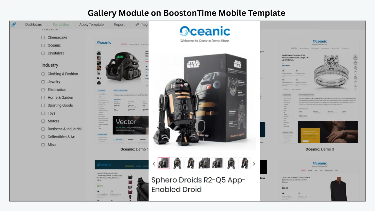
A mobile gallery should tell a coherent visual story. More images are not automatically better. Every image should answer a question or reduce uncertainty. Random ordering forces buyers to swipe without knowing whether the next image will be useful.
Start with the complete item. Then move through important angles, close-ups, labels, connectors, measurements, included accessories and condition details. For used products, place meaningful flaws where buyers will see them before purchasing. For items where size is difficult to judge, include an appropriate scale reference while still stating the exact dimensions in text.
Test the gallery with a thumb, not just a mouse. Can the buyer move through images comfortably? Are thumbnails or controls too small? Does the first image remain dominant? Does the gallery create a very long block before any explanatory text appears? The answer may require fewer images in the template area while preserving full product evidence in eBay’s native image experience.
BoostOnTime’s Gallery module gives images a defined place in the template and automatically uses supported listing images. Pair it with a concise Description opening so the visual and written evidence reinforce each other.
The gallery is easy to navigate, the order feels intentional and each image contributes evidence rather than decorative repetition.
Test 7: Make Specifications Work on a Narrow Screen
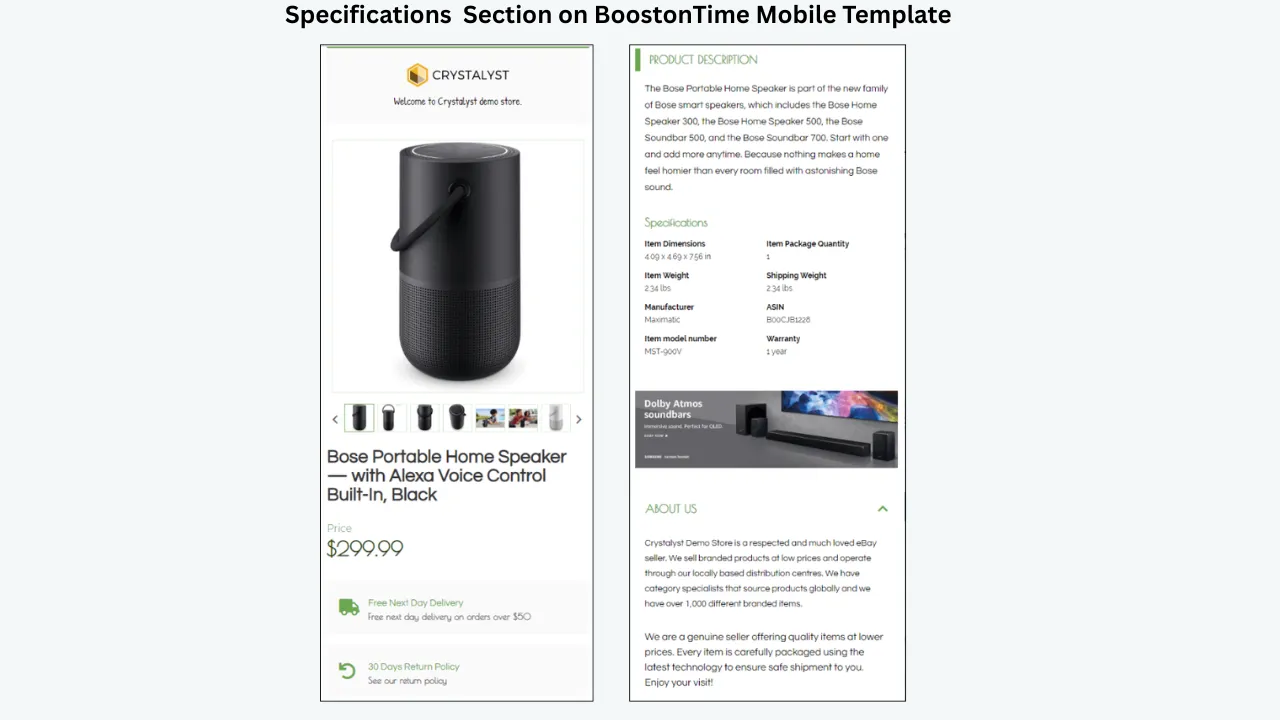
Specifications often create the most obvious mobile failures. A wide desktop table may contain five columns, long values and fixed widths. On a phone, it can shrink into unreadable text or extend beyond the screen.
Use a simple label-and-value structure. Keep labels short, use consistent units and split unrelated information into logical groups. If a table contains long explanatory sentences, it may not be a table at all. Move narrative content into the Description module and reserve Specifications for facts buyers compare.
Good specification content may include:
- Brand and model
- Dimensions and weight
- Material or composition
- Colour or finish
- Size or capacity
- Compatibility
- Condition
- Included components
- Part or reference number
- Relevant certification or warranty information
The Specifications module in BoostOnTime gives structured details their own readable section. It works best when the source information is accurate and consistently formatted. Do not use the module to repeat every item specific without judgment. Emphasize the facts that help the buyer confirm suitability, and keep eBay’s structured item specifics complete at the source.
Every specification is readable without horizontal scrolling, and buyers can compare important facts quickly.
Test 8: Check Every Tap Target and Link
Desktop users can select small links with a cursor. Mobile buyers use a finger, which is less precise. Links placed too close together create accidental taps. Tiny text links are difficult to use. A button that looks interactive but does nothing damages trust.
Test every permitted link in the template. Tap it on a real phone. Confirm that it goes to the intended destination, opens safely and does not take the buyer somewhere unexpected. Remove outdated categories, ended listings and placeholder URLs.
eBay restricts links that take buyers away from the marketplace. Its links policy generally permits certain eBay pages, product videos, approved freight-shipping services and legally required information, subject to current rules. Do not assume a link is acceptable because it worked in an old template. Review the current policy and use secure HTTPS where a permitted external link is required.
BoostOnTime modules such as Header Menu, Helpful Links, Categories and Related Products can support navigation inside the eBay experience. Use them selectively. Mobile navigation should shorten the buyer’s route, not create a miniature website menu before the product.
All links are permitted, current, descriptive and easy to tap without selecting a neighbouring item accidentally.
Test 9: Keep Navigation Helpful and Compact
Navigation can turn a listing into a connected store experience, but it can also become a barrier. A buyer who opened one product should not have to scroll through every store category before reaching the description.
Look at the Header Menu in its collapsed or stacked mobile state. Does it take over the screen? Are labels short enough to wrap cleanly? Are categories organized around buyer language rather than internal stock terminology? Can the buyer return to the product content easily?
The Categories module should also be curated. If a store has dozens of categories, showing all of them can create noise. Feature the categories most relevant to the current template or product family. A fashion template may prioritize dresses, tops and accessories, while an electronics template may prioritize models or device families.
BoostOnTime lets you create multiple templates with different stored settings and navigation structures. That means you do not need one global menu for every product. You can build category-aware experiences while retaining consistent branding.
Navigation is secondary to the product. If testing shows that a menu pushes key information too far down, simplify it or move discovery elements later. The goal is useful continuation, not maximum link count.
Navigation offers a small number of meaningful paths without delaying product understanding or dominating the first mobile screen.
Test 10: Make Shipping, Payment and Returns Easy to Find
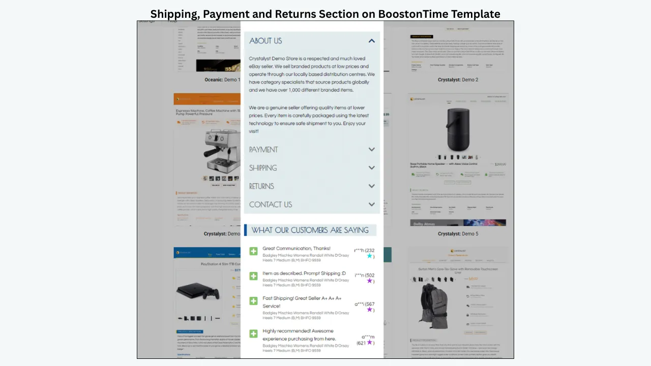
Buyers often check policy information immediately before purchasing. On mobile, long pages and hidden sections can make those answers feel farther away. Your template should give shipping, payment and return information a consistent, recognizable location.
Review the Policy Tabs module on a phone. If the presentation uses tabs or expandable sections, confirm that labels are readable and controls respond reliably. Check whether the content is still accessible when text wraps. Do not hide a critical restriction inside a collapsed section with an unclear label.
The template’s wording must agree with the live eBay business policies and listing settings. If your return window, dispatch time or shipping service changes, update the applicable eBay settings and the shared template content. Contradictions create confusion and may expose the seller to disputes.
BoostOnTime stores shared policy content as a static part of the template. This is valuable for maintenance: a consistent policy structure can be applied across suitable listings instead of retyped for each item. When different categories have genuinely different fulfilment or return needs, create separate templates rather than forcing one policy block everywhere.
A mobile buyer can locate and understand shipping, payment and return information quickly, and it matches the current eBay listing settings.
Test 11: Balance Branding, Trust and Product Focus
Trust matters, especially when buyers do not recognize the seller. But mobile trust is not created by filling the screen with claims. It comes from consistency, clear service information, genuine feedback and accurate product presentation.
Keep the Logo module visible but proportionate. A logo should identify the store, not occupy the space needed for the item. Use Why Us to explain specific reasons to buy from the seller, such as category expertise, careful inspection, secure packaging or responsive support. Avoid generic superiority claims that cannot be verified.
The Feedbacks module can integrate customer comments and rating information into the template, giving buyers genuine social proof during consideration. Test how many entries appear on mobile and how much vertical space they use. A short, relevant selection is more persuasive than a very long wall of comments.
BoostOnTime helps centralize these elements. Logo, Why Us and other shared modules can be stored within the template, while Feedbacks supports visible customer experience. The result is a consistent store identity without rebuilding the same sections listing by listing.
The mobile template feels recognizably professional and credible, yet the product remains the main visual and informational focus.
Test 12: Keep Related Products Relevant
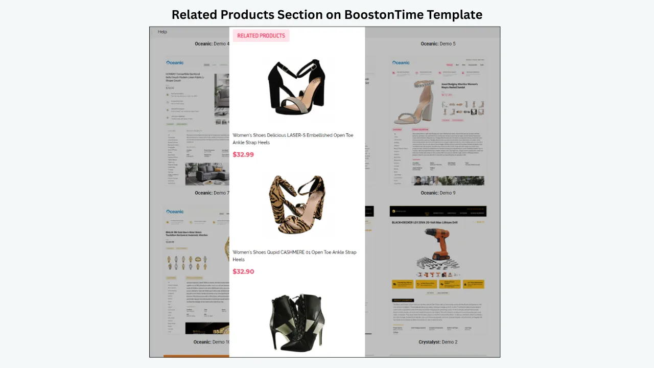
Related products can help a buyer discover a better option, replacement, accessory or coordinated item. On mobile, however, a large cross-selling block can become a long detour. Relevance matters more than volume.
Ask why each recommendation appears. Does it fit the same device? Is it another size or colour? Is it a necessary accessory? Is it a meaningful alternative? Random products may be useful for broad discovery, but manual selection gives greater control when compatibility or style matters.
Placement also affects intent. Related Products usually belongs after the buyer has understood the main product, not before the essential specifications. If the item is complex or high consideration, let the core decision content lead. If the category supports browsing, such as fashion or home decor, related items may appear somewhat earlier but should remain subordinate.
BoostOnTime can collect related products and their pricing dynamically. Sellers can use random catalogue products or select items manually from settings. This turns the template into a more connected store experience while reducing repetitive setup.
The recommendation block remains compact, readable and directly relevant to the product or buyer’s likely next need.
Test 13: Audit Loading Weight and Visual Clutter
Review every banner, mini banner, image and promotional block. Ask whether it answers a buyer question or advances a useful action. If not, remove it. A focused template often feels faster because the buyer reaches meaningful content sooner, even before detailed performance measurement.
Optimize image dimensions and compression before upload while preserving the clarity required for inspection. Avoid using an image where styled text will do. Reuse a restrained set of brand assets instead of loading many decorative variations. Do not embed heavy third-party elements merely to make the page feel interactive.
eBay does not allow active content such as JavaScript-driven animation, Flash, plug-ins or form actions in listing descriptions. This restriction supports security, mobile usability and loading performance. A modern template should rely on clean structure and responsive styling rather than outdated scripts.
BoostOnTime gives you more than 20 modules, but you do not need to activate all of them. The value of a modular builder is selection. Choose the blocks that serve the product, then disable the rest. Different product categories can use different saved templates instead of one overloaded universal design.
Every visible module has a buyer-focused purpose, graphics are appropriately optimized and the listing reaches useful content without unnecessary delay.
Test 14: Review eBay Policy Compliance
A beautiful mobile layout is not ready if it conflicts with eBay rules. Policies change, so compliance should be a publishing test rather than a one-time assumption.
Check active content, links, images, videos, text ownership, endorsements and transaction language. Do not include JavaScript, Flash, plug-ins, pop-ups or form actions. Do not direct buyers away from eBay to complete a purchase. Use only links permitted by eBay’s current policy. Create original text and use images or videos you own, receive through the eBay catalogue or have explicit permission to use.
Confirm that the description accurately represents the item. Product information should agree with the title, condition, item specifics, photos, price and policies. Do not use unrelated keywords or claims merely to attract more views. Mobile brevity does not justify leaving out a material flaw, compatibility limitation or included-item detail.
BoostOnTime’s workflow can clean old HTML and apply the newly selected template to the description. That provides an opportunity to replace inconsistent presentation with a current responsive framework. Sellers must still verify the product content and current eBay requirements before publishing.
The listing uses accurate, authorized and policy-appropriate content, with no prohibited active elements or unapproved links.
Test 15: Test the Published Listing on Real Devices
Preview is essential, but the live listing is the final product. The eBay website, app, browser and device can influence how the description is displayed. A template should therefore be tested after publication, not only inside the editor.
Run through the entire journey:
- Open the listing from search or a direct eBay page.
- Confirm the main product identity immediately.
- Open and review the images.
- Read the opening summary without zooming.
- Scan the specifications and condition information.
- Test permitted navigation and related-product links.
- Find shipping, payment and return information.
- Confirm that no element clips, overlaps or scrolls sideways.
- Note loading delays or unexpected jumps.
- Compare the live result with the intended preview.
If the controlled group passes, BoostOnTime’s Batch Revision Tool can apply the completed template to an individual listing or selected group. Expand gradually, then spot-check the broader catalogue. This controlled process protects the store from multiplying a hidden issue across every active listing.
The live eBay listing works comfortably across the tested phones, orientations and viewing environments, with no material difference that harms understanding or navigation.
How BoostOnTime Turns the Checklist Into a Repeatable System
A checklist is valuable, but manually maintaining hundreds of individual HTML descriptions is still difficult. One listing may pass today while older listings retain outdated branding, policies or layout code. BoostOnTime ETB addresses that operational problem by connecting the design framework to the seller’s existing eBay catalogue.
Start From a Responsive Theme
Choose from Cheesecake, Oceanic and Crystalyst theme families, then select the variation that suits your products and brand. The themes provide responsive foundations for mobile, tablet and desktop viewing. You are not starting from an empty code editor or trying to repair a rigid downloadable file.
Arrange More Than 20 Customizable Modules
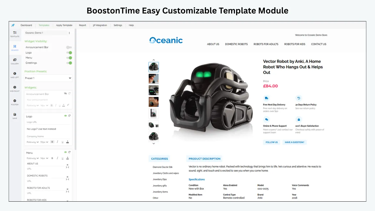
ETB includes modules for Logo, Header Menu, Title and Price, Gallery, Why Us, Categories, Descriptions, Specifications, Helpful Links, Banners, Newsletter, Side Mini Banners, Policy Tabs, Feedbacks, Mini Banners, Related Products and Footer, among others.
The advantage is not merely having many modules. It is being able to choose the modules that fit the product, arrange the buyer journey and leave out blocks that create clutter. A fashion template can emphasize images and sizing. An automotive template can emphasize part details and compatibility. A collectible template can elevate condition, specifications and trust.
Combine Static and Dynamic Information
Static modules store shared template information such as the logo, greeting, menu, helpful links, Why Us content, banners and Policy Tabs. Configure these elements once for the template instead of rebuilding them for every SKU.
Dynamic modules collect supported listing-specific information such as the title, price, currency, product images and related products with their pricing when the template is applied. Other supported listing information can also be incorporated through the ETB workflow. This connection reduces repetitive formatting while keeping the product presentation tied to the source listing.
Build Multiple Templates for Different Categories
Mobile priorities change by product type. ETB allows multiple templates, so one store can maintain different module orders and policies without losing brand consistency. This is especially useful when categories have different buyer questions, image needs or fulfilment terms.
Preview, Test and Apply in Batches
Preview the design before publishing, then apply it to a controlled group. Once the listings pass the fifteen tests, use Batch Revision to update selected groups. BoostOnTime supports unlimited listing updates under its subscription model, making catalogue-wide maintenance more practical than manual one-by-one changes.
Support International and Multichannel Workflows
BoostOnTime covers 19 eBay sites and supports integrations with more than 10 multichannel systems. International sellers should still confirm marketplace-specific content and policy requirements, but a repeatable responsive framework helps maintain a more consistent presentation across supported operations.
Which ETB Modules Matter Most on Mobile?
Quick reference
| ETB module | Mobile purpose | What to verify |
|---|---|---|
| Logo | Establishes store identity | Compact size and clear contrast |
| Title and Price | Confirms the item and price context | Short, readable opening placement |
| Gallery | Shows product evidence | Responsive scaling and useful order |
| Descriptions | Explains benefits, condition and included items | Short paragraphs and clear headings |
| Specifications | Organizes comparable facts | Clean wrapping and concise labels |
| Why Us | Explains seller expertise and service | Specific claims and restrained length |
| Feedbacks | Adds genuine customer experience | Readable entries without excessive page length |
| Policy Tabs | Presents payment, shipping and returns | Easy access and consistent live policies |
| Header Menu | Connects relevant store destinations | Few items and tap-friendly spacing |
| Categories | Supports catalogue exploration | Relevant category selection |
| Related Products | Shows alternatives and complements | Active, relevant and compact recommendations |
| Banners | Highlights one focused message | Appropriate dimensions and minimal use |
| Footer | Closes the template consistently | Short, uncluttered information |
Use this table to design with intent. A module is not valuable simply because it is available. It earns its place by answering a question or supporting a useful next step.
A Practical BoostOnTime Mobile Publishing Workflow
Select Representative Listings
Choose five to ten listings that expose different layout conditions: long and short titles, portrait and landscape images, simple and complex specifications, new and used items, and at least two product categories if the template will span them.
Audit the Source Data
Correct titles, images, descriptions, item specifics, categories, prices and policy settings before designing. Dynamic modules cannot compensate for incomplete or contradictory source information.
Choose the Closest Theme
Preview Cheesecake, Oceanic and Crystalyst variations. Select the theme that provides the right hierarchy and image emphasis rather than choosing only by colour.
Define the Mobile Order
Write the desired module sequence before adding decorative elements. Put the product, gallery, summary and essential facts before secondary promotions.
Configure Static Modules
Add the Logo, Header Menu, Why Us content, Helpful Links, banners and Policy Tabs. Keep them concise and confirm that every shared statement applies to the listings that will use the template.
Configure Dynamic Modules
Place Title and Price, Gallery and Related Products where they support the journey. Review the source listing so the imported information will be accurate and useful.
Remove Low-Value Blocks
If a module does not help the buyer understand, trust or navigate the offer, disable it. Mobile space should be earned.
Preview the Complete Template
Read from the top to the bottom. Test long titles, large image sets and complex specifications. Correct wrapping and spacing before touching live listings.
Apply to a Controlled Group
Use the Batch Revision workflow for a small selection rather than the entire catalogue. Confirm that each listing displays the correct dynamic information.
Complete All Fifteen Tests
Use the checklist on actual phones and in the eBay app and browser. Record failures precisely, including device, orientation, module and listing.
Correct the Template Once
Fix shared layout or policy problems in the template rather than editing every listing independently. Correct product-specific data at the source.
Expand and Monitor
Apply the approved framework to other suitable listing groups. Continue spot checks after large revisions, category changes or policy updates.
BoostOnTime Pricing and the Seven-Day Trial
BoostOnTime offers a monthly plan at $6.99 per month and a yearly plan billed at $59.88 per year, equivalent to $4.99 per month. Both options support multiple templates and unlimited listing updates. Pricing can change, so confirm the current details on the BoostOnTime eBay Template Builder page before publishing or subscribing.
The seven-day trial is enough to test a serious mobile workflow if you use it deliberately:
Day 1
Choose representative listings and audit their source content.
Day 2
Select a responsive theme and define the mobile module order.
Day 3
Configure static branding, navigation and policy content.
Day 4
Place dynamic product modules and refine descriptions.
Day 5
Preview and complete the first fourteen checklist tests.
Day 6
Apply the template to a controlled listing group.
Day 7
Test live devices, correct issues and decide whether to expand.
Frequently Asked Questions
It is a template that adapts to narrow screens, keeps text readable, scales images correctly, organizes information in a logical mobile order and avoids elements that cause overflow, delay or policy problems.
Not completely. Responsiveness handles layout adaptation, but sellers must still choose the right content order, image sizes, modules, links and wording. Live-device testing remains essential.
The buyer should quickly see the product identity, useful images and the most decision-critical facts. Large banners, long greetings and unrelated navigation should not delay that information.
eBay currently recommends high-resolution images around 1600 by 1600 pixels and requires at least 500 by 500 pixels. Review the latest eBay guidance before preparing images because requirements can change.
There is no universal number. Activate the modules that answer buyer questions or support a useful next action. A focused template with fewer relevant modules is better than one that uses every available block.
No. eBay does not allow active content such as JavaScript, Flash, plug-ins or form actions in listing descriptions. Use responsive, standards-based presentation instead.
Generally, eBay listing descriptions cannot direct buyers to outside websites, with limited exceptions defined by eBay. Use permitted eBay destinations and review the current links policy before publishing.
They should fit the screen, wrap long values cleanly and use short labels. If the information is too complex for a narrow table, divide it into logical groups or use concise labeled paragraphs.
Yes. ETB can collect supported product images from current eBay listings and populate them through the dynamic template workflow. Sellers should verify image quality and order at the source.
Yes. BoostOnTime supports multiple templates, allowing different product categories to use distinct module orders, navigation and policies while preserving consistent branding.
Title and Price, Gallery, Descriptions, Specifications and Policy Tabs form a strong core. Logo, Why Us and Feedbacks support trust, while Categories and Related Products support relevant discovery.
Yes. Batch Revision can apply a completed template to an individual listing or selected group. Test a small representative set before expanding the update.
No. A responsive, organized template can improve clarity and usability, but results also depend on product demand, pricing, item specifics, images, shipping, seller performance, competition and other factors.
Test both. The app and mobile browsers may present the listing differently. Use actual phones where practical and check portrait and landscape orientations.
Use it before a new template launch, after major design or policy changes, when adding a new category and during periodic quality reviews. Spot-check live listings after batch updates.
Begin with the seven-day trial, choose a responsive theme, build the template around a small listing group and complete all fifteen tests before applying it more widely.
Publish With Confidence, Not Assumptions
A mobile listing succeeds when the buyer can understand the offer without fighting the layout. The screen is smaller, but the buyer’s questions are not. Product identity, images, condition, compatibility, specifications, delivery and returns still need clear answers. The template must simply deliver those answers in a tighter, more disciplined order.
The fifteen tests give you an objective way to approve that experience. Check width, order, opening clarity, typography, images, galleries, specifications, tap targets, navigation, policies, trust, related products, loading discipline, compliance and live-device performance. When one test fails, fix the specific cause before expanding the design.
BoostOnTime ETB makes that process scalable. Responsive themes establish the foundation. More than 20 customizable modules let you shape the buyer journey. Static content keeps branding and policies consistent. Dynamic content connects the design to supported listing information. Multiple templates serve different categories, and Batch Revision helps apply the approved framework to selected existing listings.
That is more useful than treating mobile optimization as a final visual check. It becomes part of how your store creates, reviews and maintains listings.
Turn This Checklist Into a Repeatable Workflow
Ready to build a mobile-ready template and test it properly?
🚀 Start Your Seven-Day BoostOnTime ETB Trial
boostontime.com/ebay-template-builder